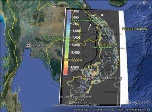
The Correlation Between the Ho Chi Minh Trail and Herbicide Concentrations

In this image, from google earth, I layered a map of the Ho Chi Minh Trail, and a map of the herbicides sprayed across Vietnam during the war. Both maps are cited below.
Above, the darker lines that are coming into Vietnam from Laos and Cambodia represent the Ho Chi Minh Trail. The colorful map on top of that represents where the largest amounts of spraying occurred.
Here is a more interactive version of the map above. On the map below I labeled with the colors blue, orange, and red. Blue signifying a lesser amount of herbicide sprayed, Orange designating much higher levels of herbicide, and Red representing the most intense concentrations of herbicide. This version of the map above makes it a little easier to read the city names and hopefully gives you another way of conceptualizing the zones most affected.
View Vietnam and the Correlation Between The Ho Chi Minh Trail and Herbacides in a larger map
Source: Kenney, Marianne. “Road to Victory: Building the Ho Chi Minh Trail .” Geography and History: Partners in Understanding the American Experience. no. 3 (1993): 47-53.
Source: Stellman, Jeanne, Steven Stellman, Richard Christian, Tracy Webber, and Carrie Tomasallo. “The extent and patterns of usage of Agent Orange and other herbicides in Vietnam.” Nature, International Weekly Journal of Science. no. 6933 (2003): 681-687. http://www.nature.com.mutex.gmu.edu/nature/journal/v422/n6933/full/nature01537.html
Leave a Reply